
USKEIL — Naming & Visual Identity for an Education Brand
Industry: Online Education
Market: International
Timeline: 2 days
Deliverables: Name, tagline, logo, color palette & uskeil.com
My role: Creative concept, copywriting, visual design & domain registration
06/07
the Challenge
Company needed a name and visual identity that could unite courses across different fields without limiting the brand to one subject.
The solution had to be memorable, suitable for an international audience, connected to learning and growth, adaptable to digital use, and available as a .com domain.
you’ll be redirected to vitavaib.com ↗︎
06/07
The Concept Behind USKEIL
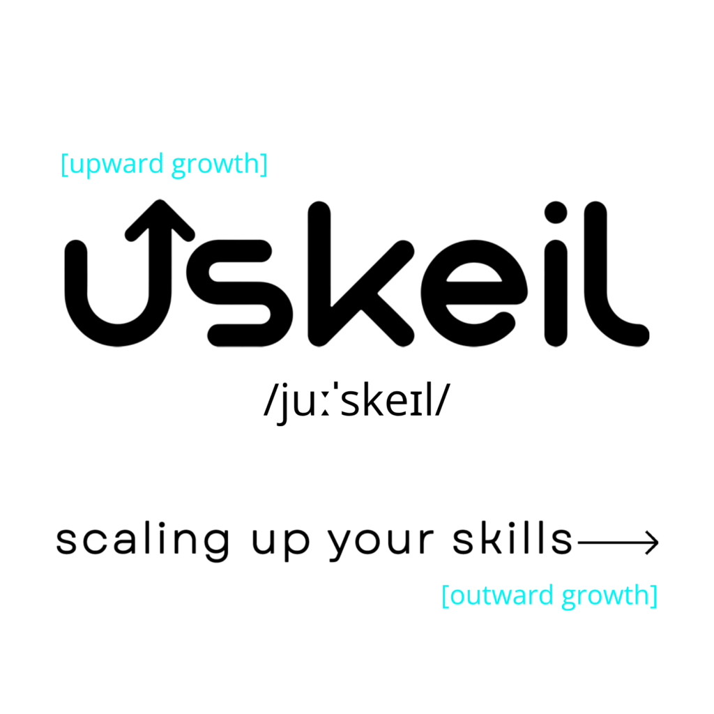
USKEIL is an original neologism in which I combined the brand’s key meanings: you, skill and scale up.
The letter “u” is pronounced like “you” and places the individual at the center. I transformed the word “skill” into “skeil”: it retains its connection to skills but sounds like “scale” — to grow and expand.
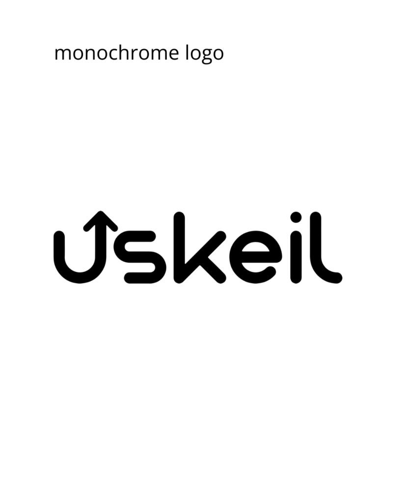
I continued this idea in the logo: the upward arrow symbolizes moving to the next level, while the rightward arrow represents expanding knowledge and opportunities. I used this wordplay to create the brand slogan: “Scaling up your skills.”
As a result, I created a unique name and verified that it did not match any other brand names. Its uniqueness made it possible to register the exact-match domain uskeil.com — without adding extra words, numbers, or changing the spelling.
06/07
Visual Identity
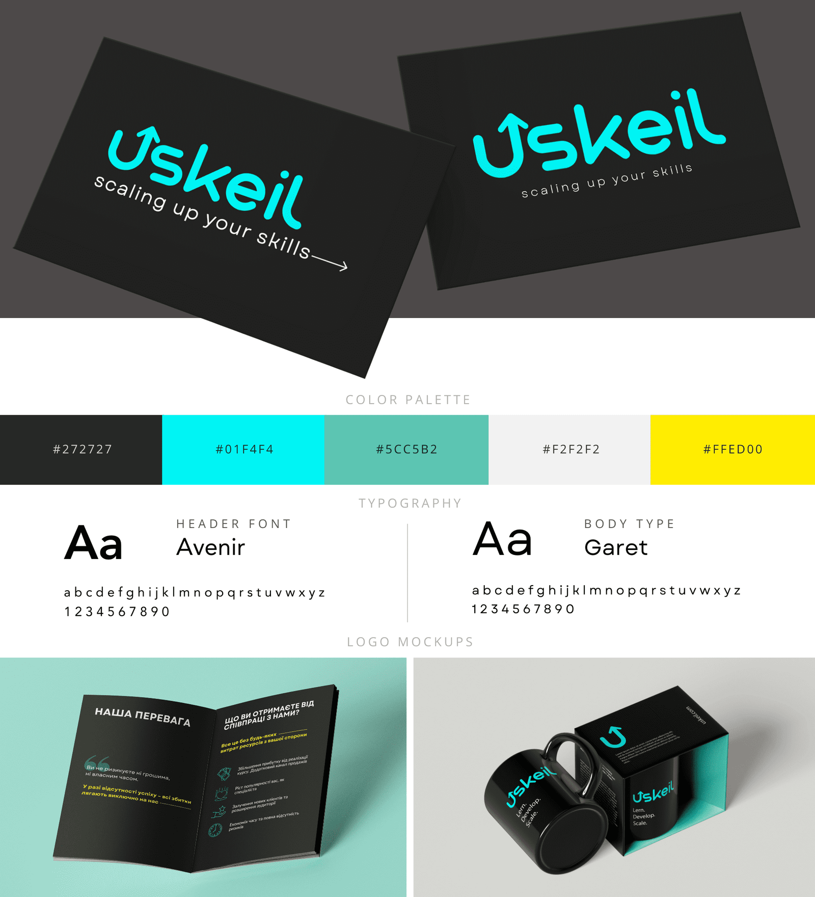
A flexible visual identity designed to keep USKEIL recognizable and consistent across digital and print

02
сolor palette
WordPress websites and landing pages built from scratch as complete marketing tools — not just visually appealing pages. Full-cycle development: structure, copy, user flow, offer presentation, design, mobile adaptation, and launch — so you receive a complete, ready-to-use website.
graphite
#272727
creates a strong foundation
electric cyan
#01F4F4
primary brand color
soft mint
#5CC5B2
balance the palette
off-white
#F2F2F2
balance the palette
yellow
#FFED00
reserved for selective highlights
03
typography
WordPress websites and landing pages built from scratch as complete marketing tools — not just visually appealing pages. Full-cycle development: structure, copy, user flow, offer presentation, design, mobile adaptation, and launch — so you receive a complete, ready-to-use website.
heading typeface Avenir
used for headlines to create clear hierarchy and a modern, confident tone
Aa
Learn. Develop. Scale.
ABCDEFGHIJKLMNOPQRSTUVWXYZ
abcdefghijklmnopqrstuvwxyz
01234567
body typeface Garet
Used for body copy to keep longer text clean, balanced and easy to read
Aa
Build skills for what comes next.
ABCDEFGHIJKLMNOPQRSTUVWXYZ
abcdefghijklmnopqrstuvwxyz
01234567
06/07
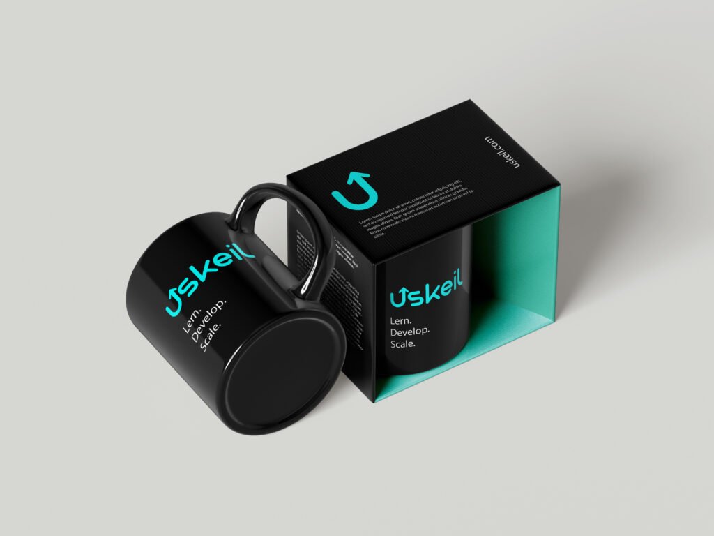
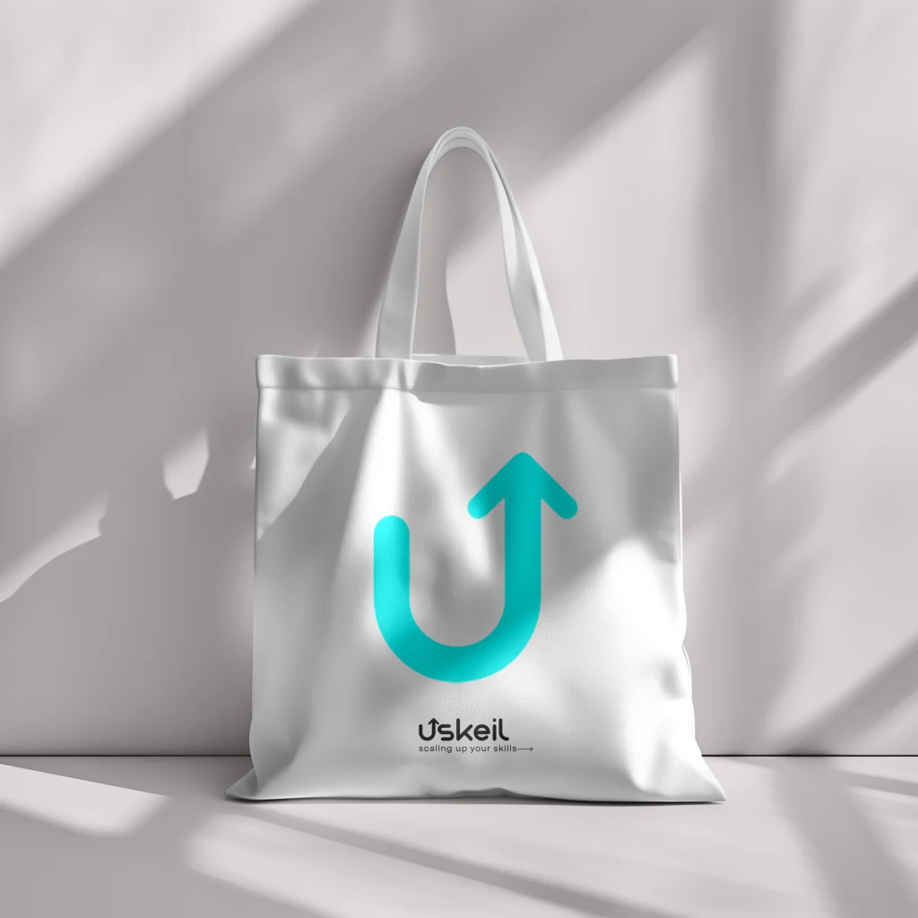
Brand applications
06/07
Final deliverables
01. Original brand name with uniqueness and domain availability verified
03. Logo suite: primary logo, brand mark, reversed and monochrome versions
04. Color palette with HEX, RGB and CMYK codes
05. Typography system for headings and body copy
06/07
Need a distinctive name and visual identity?
bjbhb